Right! So you’ve got a website, its all shiny and new with your lovely pages and header. But… There’s something you’re forgetting. You just can’t put your finger on it…
Its the footer!!! A critical bit of info for any website that is far too often overlooked!
So lets delve into some tips and tricks for creating the perfect footer!

KISS
Keep It Simple Stupid… Duh! Your footer will likely have a lot of info, and you don’t want to overwhelm with a complicated design too!
Make the design as clean and simple as possible, use lots of white space, and think about whether you really need each element… Avoid Clutter!!!
The example below has all the key info in a very minimalist style – now not everyone will be able to keep it this minimal but you can still adopt a clean style and show your info!


Link your info
‘About Us’ and ‘Contact Us’ are the key things clients will look for in your footer, so make sure they’re there!
People can lose business cards or forget your amazing in-person pitch so this is a must!!
Along with this, you NEED basic info like your phone number, business address and email!
It sounds silly but people forget! And remember all of these should be hyperlinked with the links set to open in a new tab! KEEP PEOPLE ON YOUR SITE

footer links
Be organised!! Sort your links into categories under mini headers to make it easier for the client to find what they need!!
Clients are lazy! they don’t want to search through a long unorganised list just to find your email! Organisation is key! I recommend sorting into ‘Shop’, ‘Contact’ and ‘Help’.
This also looks way neater and cleaner – gloing back to KISS
copyright
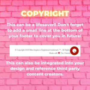
This can be a lifesaver!! Don’t forget to add a small line at the bottom of your footer to cover you in future!
This can also be integrated into your design and reference third party content creators.
Call to actions
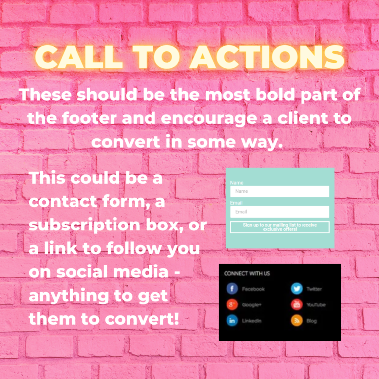
These should be the most bold part of the footer and encourage a client to convert in some way.
This could be a contact form, a subscription box, or a link to follow you on social media – anything to get them to convert!
And make sure these CTAs are the boldest part of the page! They should be super enticing and stand out!
Top tip: Make sure these links open in new tabs to keep visitors on your site still!!!

design theme
Maintain your design theme! The footer should not look like a disjointed afterthought, it needs to flow with the rest of your site.
Your footer doesn’t have to be some boring, corporate looking add on to your pretty website. It should continue representing you and your brand! So keep using those brand colours and fonts, add a logo, and even use an image as the background if you think it looks a bit drab!


